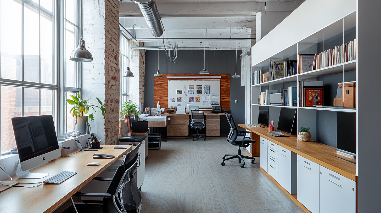
Maximizing Small Office Spaces: Clever Design Hacks
Colors are more powerful than you might think. Beyond being a part of design, colors play a significant role in shaping mood, focus, creativity, and overall workplace atmosphere. The right office color palette can increase productivity, reduce stress, and build a space that reflects the cultural and professional identity of your company.
Whether you’re an office manager redesigning a workspace or an interior designer curating the perfect office interior, understanding the psychology of colors can help you create the ideal environment for your team. This guide will walk you through how colors influence behavior, productivity, and collaboration in an office setting and help you choose the right palette.
The Impact of Color on Mood and Productivity
How Colors Influence Behavior
Colors have a powerful influence on our thoughts and emotions. Warm shades like red and orange boost energy and excitement, while cooler tones like blue and green foster calmness and concentration. Selecting the right colors for various areas of your office can enhance productivity and create a harmonious work environment.
Warm tones energize and motivate, but they can also overwhelm if overused. Cooler tones are better for focus and reducing stress, making them ideal for workstations and quiet areas.
Pro Tip: To ensure your design steps align with your office interior goals, consider how you want employees to feel and act in each space.
Color Choices for Different Areas of the Office
Workstations & Desks
- Blue: Blue enhances focus, promotes calmness, and boosts productivity, making it an ideal choice for spaces that require concentration.
- Green: Reduces stress and eye strain, making it perfect for workers in long-hour desk jobs.
- Gray: Neutral and professional for focused work, but when overdone, it might feel boring or uninspiring.
Collaborative Spaces
- Yellow: Encourages creativity and energy, perfect for brainstorming or ideation rooms.
- Orange: Stimulates enthusiasm and boosts collaboration, ideal for group working zones or meeting rooms.
- Red: Evokes a sense of urgency and action but can feel intense if overused. Use it sparingly in collaborative spaces or high-energy rooms.
Break Rooms & Lounges
- Green and Earth Tones: Create a serene and calming rejuvenation zone.
- Pastels: Offer softness and a soothing environment, promoting relaxation during breaks.
Hallways & Reception Areas
- White or Light Neutrals: Clean and light, these colors create an open, professional impression.
- Wood Tones: Adding warmth and sophistication, these are inviting and comforting to guests.
Explore more office interior designs tailored for productivity on our Design Page. (Office Design Trends to Watch for in 2025)
Understanding Warm vs. Cool Colors in Office Design
Warm Colors
Warm hues like red, orange, and yellow are stimulating and inspire energy. While red can ignite action, orange promotes enthusiasm, and yellow sparks creativity. Use these colors in spaces where focus and action are critical, such as collaborative rooms or high-energy meeting spaces.
Tip: Balance these colors with neutrals for a cohesive and non-overwhelming look.
Cool Colors
Cool hues like blue, green, and teal are calming and ideal for concentration. They are excellent for workstations, individual desks, and private offices.
Balancing Warm and Cool Tones
A well-balanced design often integrates warm and cool colors effectively. Pair bold tones with neutral ones like white, gray, or beige for harmony. A balanced environment ensures employees are neither overstimulated nor unmotivated.
Color Combinations and Their Psychological Effects
Complementary Colors
Pairing colors opposite on the color wheel, like blue and orange, creates a dynamic and vibrant atmosphere. These combinations work well in high-energy areas.
Example: A workspace with blue walls and orange furniture creates an energizing yet cohesive design.
Analogous Colors
Use colors adjacent on the wheel, such as blue, teal, and green, for a harmonious and serene environment. These are perfect for workstations and break rooms.
Monochromatic Schemes
Using different shades of one color helps create a cohesive, professional look with just the right amount of variation. It’s a great choice for large corporate offices aiming for a sleek, minimalist style.
Learn more about color combinations for workplace interiors in our expert guide here. (Maximizing Small Office Spaces: Clever Design Hacks)
Aligning Office Colors with Brand Identity
Your office color palette should represent your brand identity. Here’s how color psychology aligns with branding:
- Tech Companies: Blue often conveys trust and innovation.
- Creative Agencies: Vibrant colors like yellow or purple inspire creativity.
- Healthcare: Soft greens and blues evoke wellness and calm.
Example: A creative agency could use bold accent colors and murals to make a statement, while a legal firm might opt for navy blues and gray tones to emphasize professionalism and trust.
Check out our company branding consultation services for office spaces.
The Role of Accent Colors
Accent colors are your opportunity to add personality and vibrancy to your office. They can appear in small doses, such as furniture, art, or feature walls, to break the monotony of neutral tones. Examples include a bright yellow wall in a collaborative space or orange chairs in a meeting room.
Tips:
- Don’t overpower the space with multiple accents. Stick to one or two to maintain balance.
- Use accent colors to highlight areas of interaction or interest.
Color Considerations for Different Industries
- Creative Industries: Vibrant shades and eclectic patterns set a playful tone.
- Corporate Environments: Neutral tones and muted palettes convey professionalism.
- Healthcare Settings: Calming greens and blues improve patient trust and comfort.
- Technology Firms: Futuristic palettes with blues and grays reinforce innovation and reliability.
Trends in Office Color Design
Modern Trends
The 2025 color trends lean towards sustainability and wellness-driven designs. Expect to see green, beige, and biophilic-inspired palettes that mimic nature.
Minimalist and Neutral Palettes
Neutrals such as soft gray and beige are gaining popularity for their timeless, clean appearance.
Tips for Choosing the Right Color Palette
- Assess the Space: Consider size, light source, and purpose before finalizing colors.
- Employee Input: Get feedback from your team to ensure comfort.
- Mood and Functionality: Match colors to the emotional outcome and practicality of the space.
- Balance and Harmony: Ensure the palette doesn’t overwhelm or underwhelm.
Pro Tip: Explore our services on workspace consultations for expert help in curating the perfect office palette.
Transform Your Office Through Color
Picking the right color palette can turn an office from dull and uninspiring to a dynamic space that fosters productivity, creativity, and collaboration. By tapping into color psychology, you can create an uplifting environment that boosts your team’s well-being while reflecting your brand’s identity.
Take your office design to the next level! Reach out to us to learn how our design experts can help you craft dynamic, balanced, and inspiring workspaces.
